Anatomy of a Data-rich Slide
Craft compelling slides by focusing your chart on a single insight ...
These are some of the primary elements when creating an impactful data-rich slide.
Title
There's no single right way to do slide titles. But there are some rules of thumb.
In DataStory: Explain Data and Inspire Action Through Story (2019), Nancy Duarte suggests: "Your chart title should be straight-forward, with no fluff; no unnecessary descriptive words allowed. It's simply the noun you measured and when (dates or range of dates). How you measured it (units) is usually on the y-axis." This is a solid rule of thumb, especially for certain audiences who appreciate a more direct approach.
Good Example
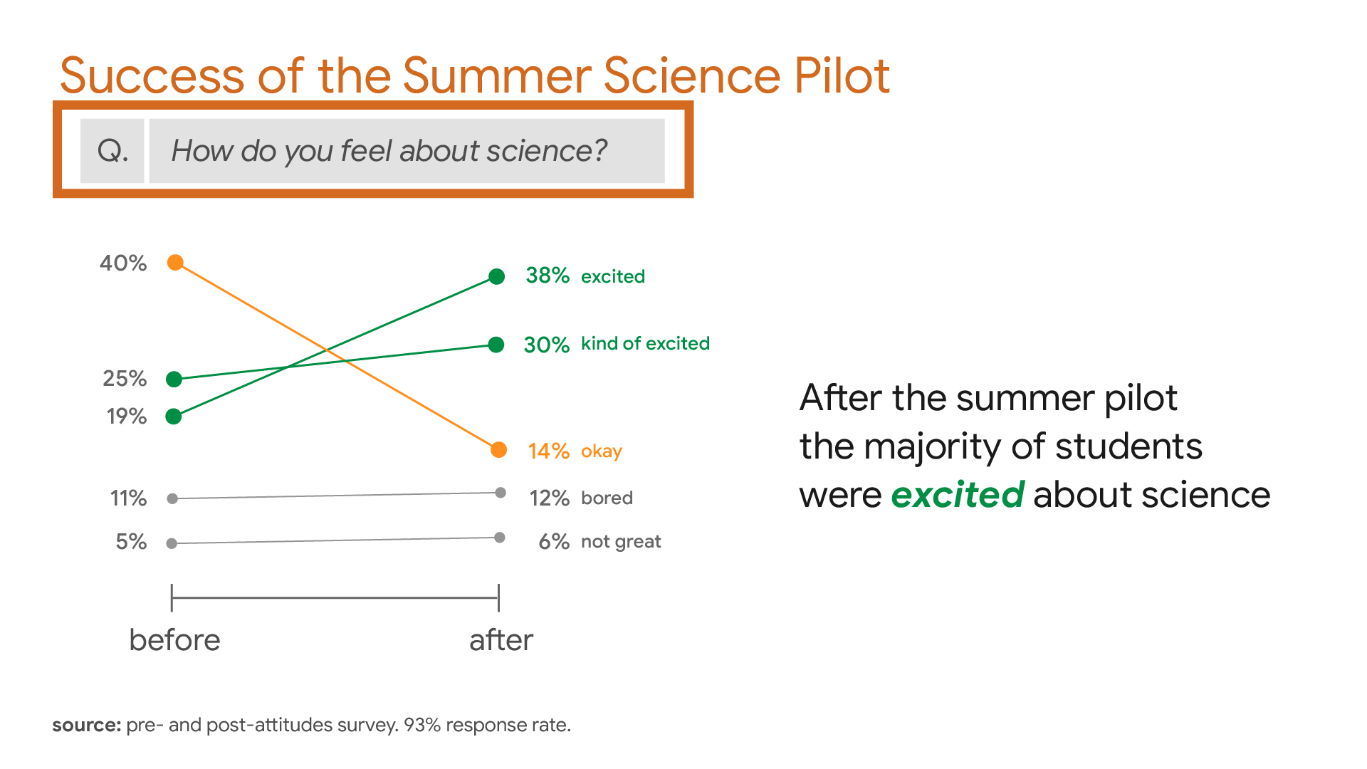
- Daily Website Traffic by Sales Region
- Yearly UK Carbon Emissions in Tonnes, 2010-2020
Bad Example
- Our Sales are Crushing the Competitors
- Survey Findings
Another way to approach the title is to think of it as the short phrase which introduces the subject area of the takeaway, which is the single insight which the chart visually supports. The first bad example is poor because it's not value-neutral (and sounds juvenile). The second example is bad because it's just too vague and doesn't mention what was measured and when, etc.
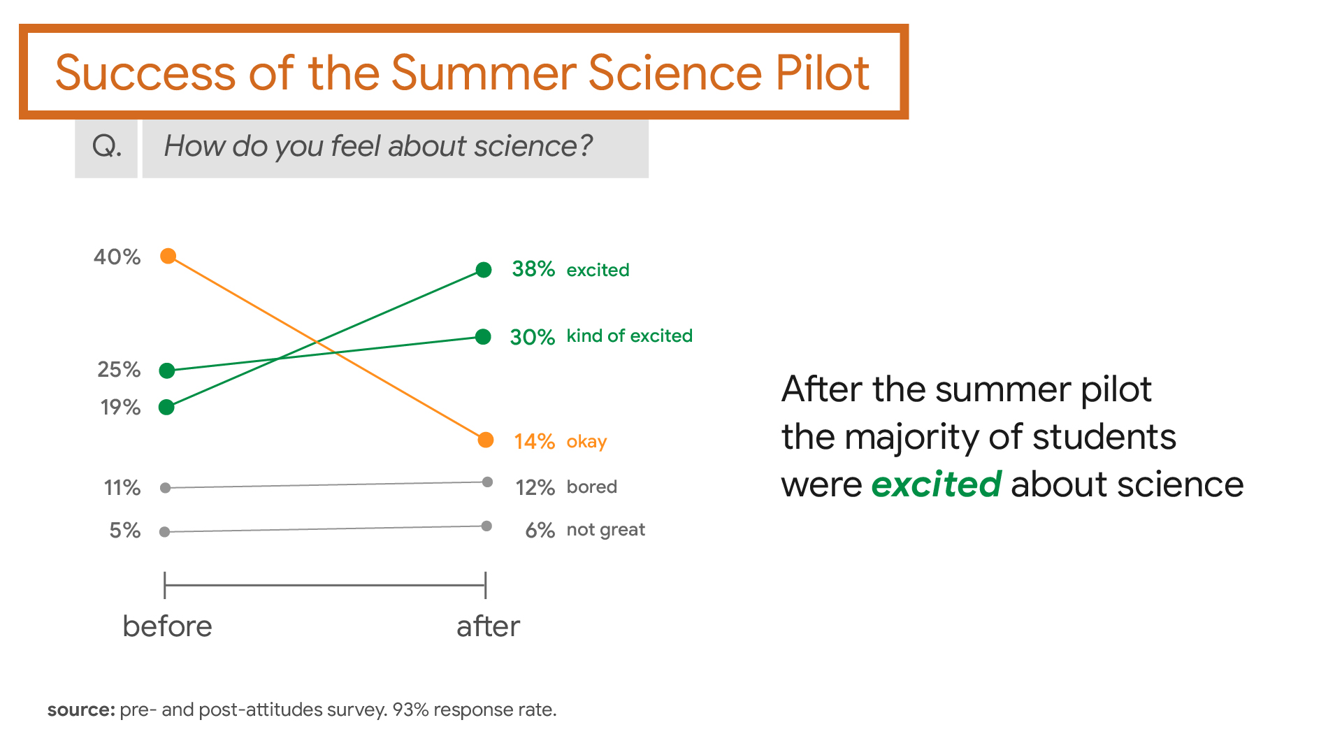
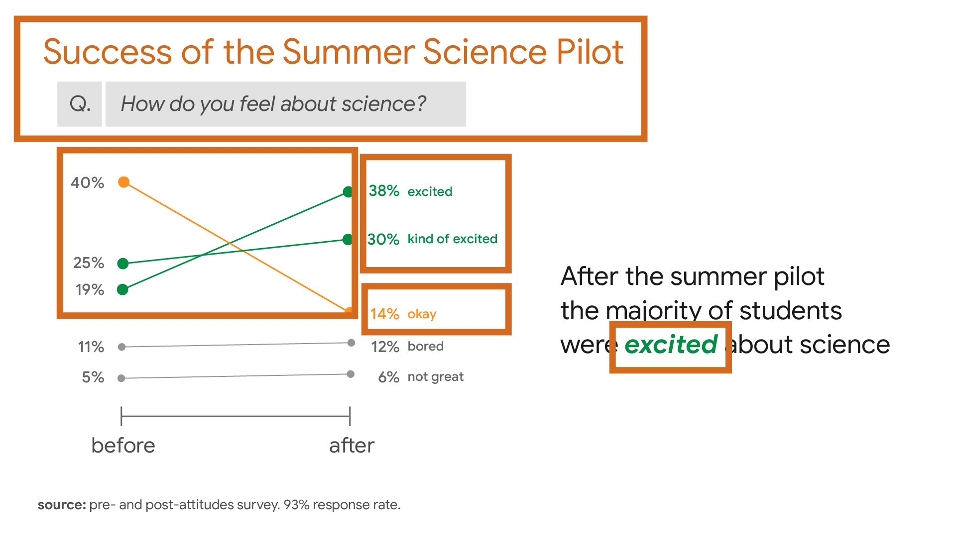
In our example chart, above, the title introduces the question/possibility of success of the science pilot. The takeaway (quantitatively supported by the chart), answers that question affirmatively—the science pilot was indeed successful in getting students more excited about science.
Subtitle
A subtitle is optional for the data-rich slide. Remember, the title is meant to generally introduce the area or subject about which your takeaway will reveal an insight. You may wish to get a little more granular by using a subtitle to add context.
Good Example
Q3 Average Daily Sales Conversions by Hour
Best Times for Conversion on 24-hour Cycle
In our example slide, above, the subtitle is not the refinement of the title, but rather a question that was asked of survey respondents. But just as with the refinement option, it helps better define the takeaway of the chart—that students were more "excited" about science after the pilot program.
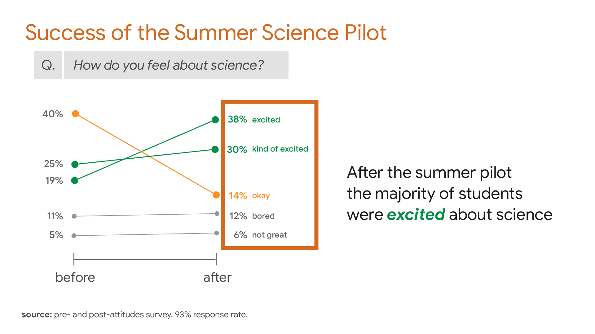
Data Labels vs. Legends
Legends are ubiquitous in many presentations. Many applications, such as Microsoft Excel, will automatically include a legend when generating a chart. The legend frequently ties color (or another attribute of focus) to specific lines in your line graph. There are certainly times when legends are useful—especially in print materials. However, when giving a presentation, a legend typically raises the cognitive load for the user by making them consult the legend to understand the significance of each datum as they read the chart.
Fig 1: Legend ad absurdum
In the case of presentations, the presenter wants her audience focused on her delivery of her message, not reading some complex chart and tuning her out. We therefore recommend removing the legend and labeling your data directly on the chart, where possible. We recommend the use of other data labels which can add clarity, including text, colors, lines, enclosures, and any other ways to help make meaning from particular aspects, outliers, anomalies, or deltas within the data.
In our example, above, we might have created a legend with green and orange blocks to associate with positive and negative results. By labeling the data directly on the chart, however, we lower the cognitive load and help the audience to more quickly and efficiently understand the takeaway.
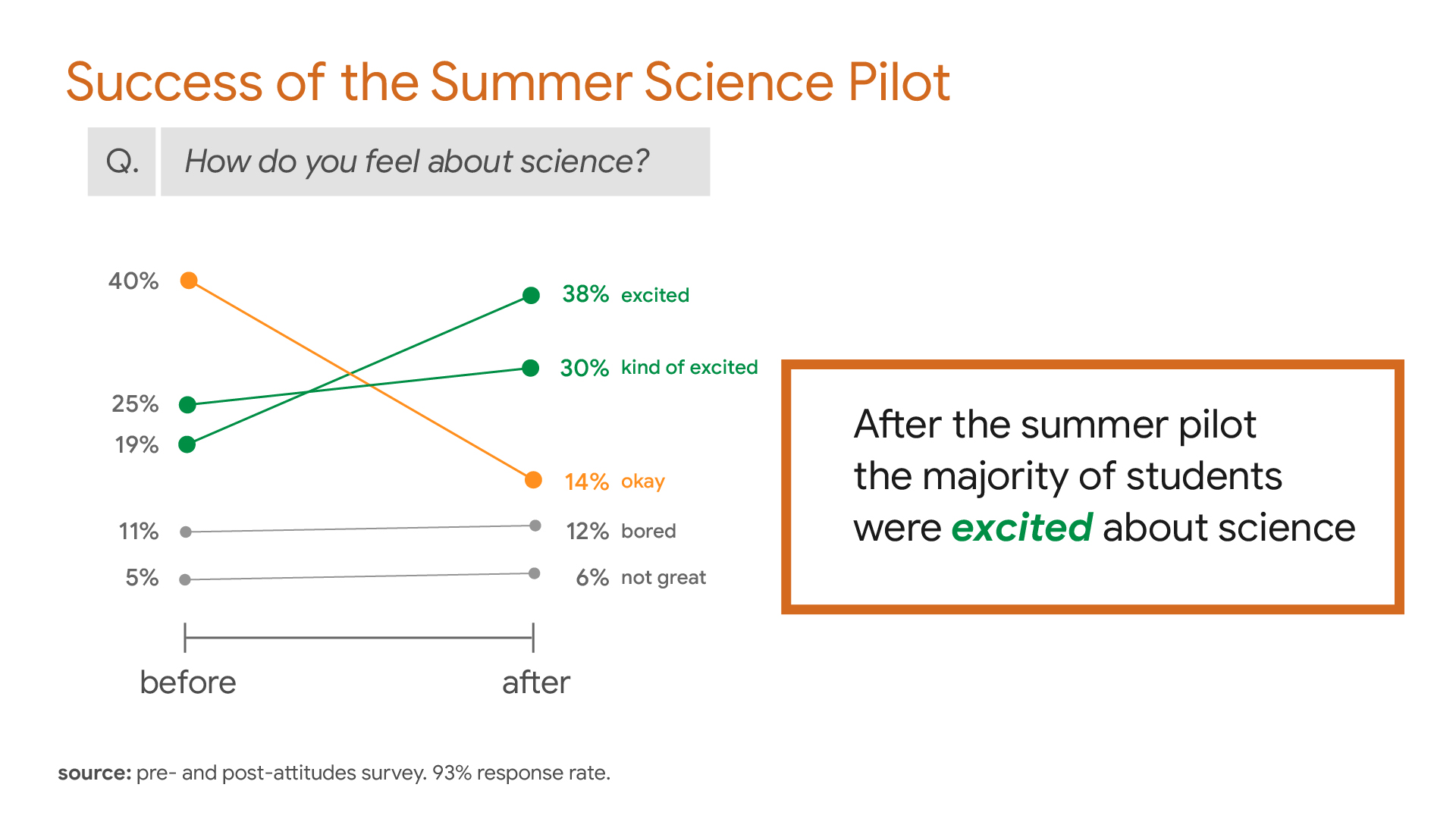
Takeaway
The takeaway is optional but recommended in most cases. It should be a brief, descriptive phrase or sentence which summarizes the chart's primary insight. To generate the takeaway, imagine that your slide has suddenly disappeared and you are forced to succinctly verbally reiterate the single insight of that slide in a short phrase or sentence.
Preattentive Attributes
Where possible, use preattentive attributes (typographic features which draw the viewer's eye) to focus their attention on particular areas of the slide. Preattentives help you emphasize meanings you wish them to derive from the data. In this example, above, the repetition of color delineates success (green) and failure (orange) and helps us focus on the most important data in the chart. Enclosure is also used to set the survey question off from the rest of the slide."
In case the user has cannot distinguish between orange and green, size is an additional preattentive we might use here. As you'll note, the size of the nodes (circular endpoints) for the green and orange lines are somewhat larger than the gray lines, suggesting greater importance.
Consider using preattentive attributes within text content, such as the takeaway. Color and other typographic formatting can easily help the audience more easily parse longer stretches of text. In our example, above, we have used bold and the color green to associate excited with the two green lines from the slope graph.
Axes
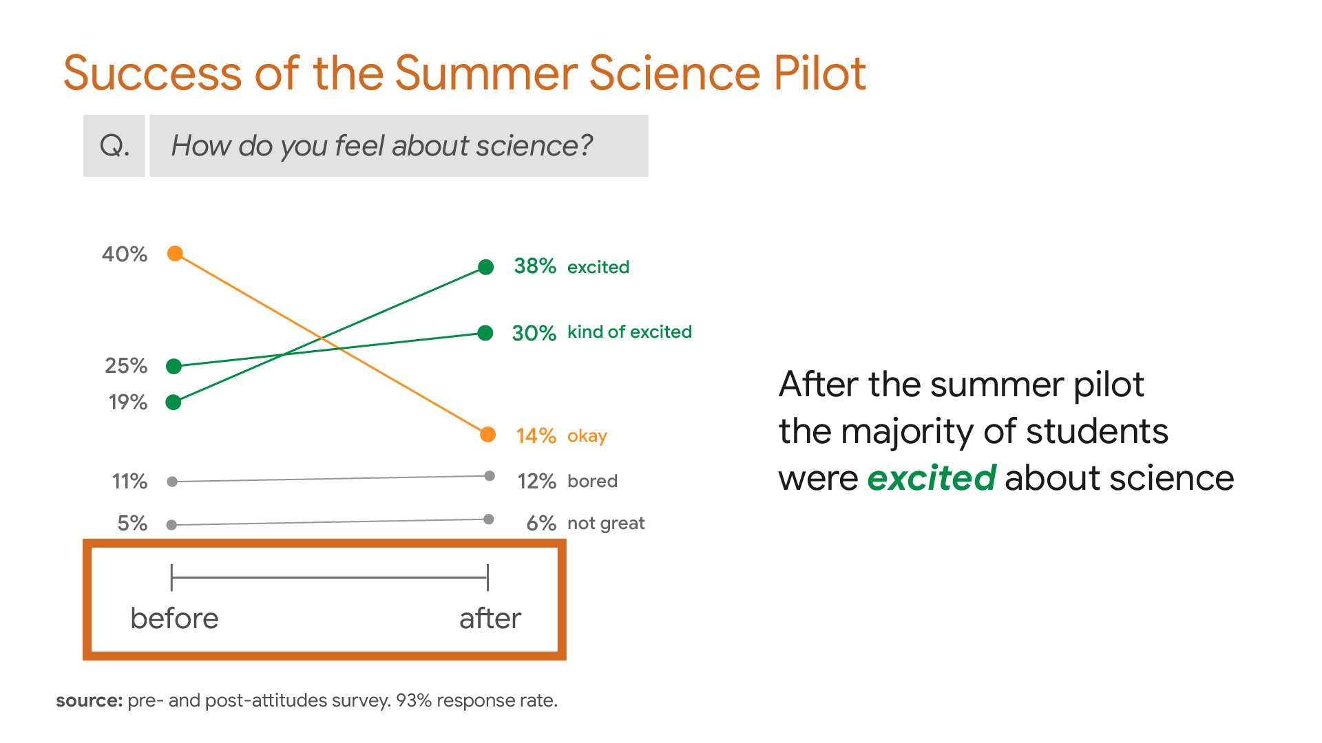
Axis values can be useful in giving the viewer a sense of scale. In certain cases, when axes are omitted, the scale of the dataset is obscured from the viewer. In other cases, where the context is clear, removing one or more of the axes can help simplify the message, lower the cognitive load, and better surface the primary insight.
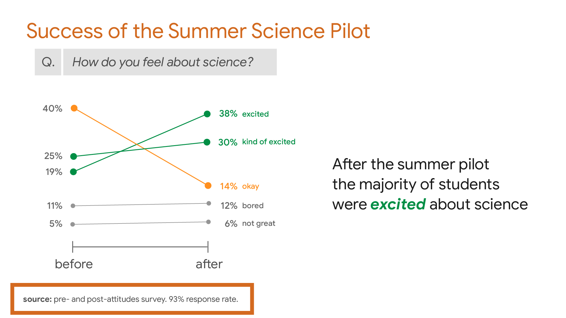
Source
Source information is important for any data, statistics, figures, and documented facts that are not common knowledge. A good rule of thumb is to source any information that you have not personally collected or generated data for.
However, source information is ancillary to the main message and purpose of the slide. The audience should be encouraged to pay close attention to the speaker, with the slide acting as visual support for the verbal claim being made. For this reason, while properly citing your data is important, we typically place this information at the bottom left of the slide in a lighter, smaller font, so as not to interfere with the impact of the speaker's connection with the audience.
Images
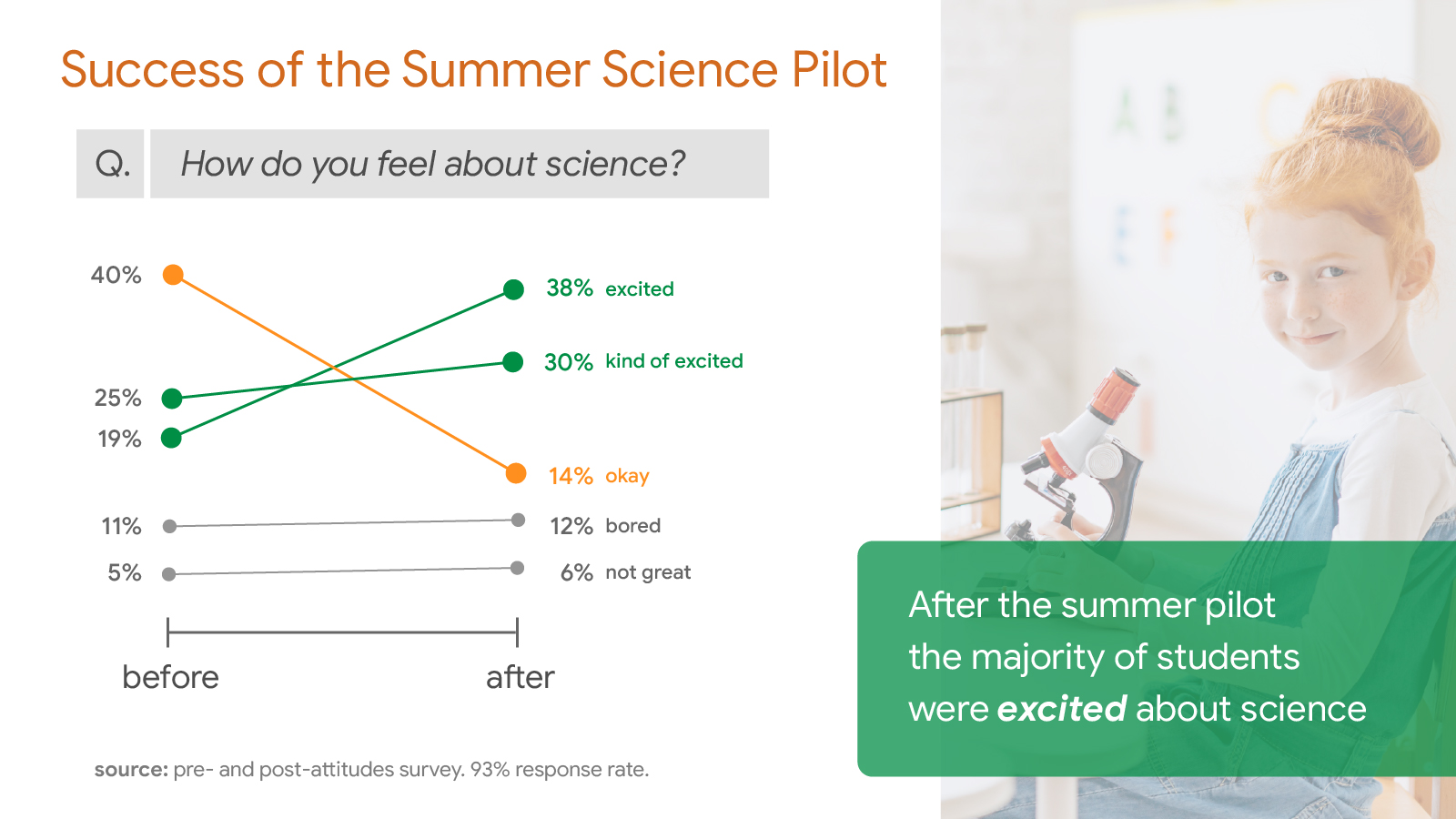
Though images can add to the audience's cognitive load, in many cases they offer benefits that outweigh the attention-draw. Images move us emotionally and provide additional types of visual support for the claims we're making on a particular slide.
In the example, above, the slope graph quantitatively supports the claim that the Summer Science pilot was a success, while the image of a smiling, happy student seated at a microscope offers qualitative, emotional support.
Use images strategically. Where possible, use images that are simple in composition and iconic (that tell a story or suggest a universal truth). Ensure images are appropriate to the tone of the presentation and that each image supports the specific insight for the slide containing it.
There are many ways to add images to your slide. In our example, above, you'll notice the takeaway is layered on top of the image by placing a semi-transparent green box underneath the text. In employing an image, always consider whether the increase in cognitive load for the user is outweighed by the image's power to encourage the audience to accept your ideas.
Sources
- Knaflic, Cole Nussbaumer. (2015). Storytelling with Data (1st ed.).
John Wiley &
Sons,
Incorporated.
https://doi.org/10.1002/9781119055259.
Hesburgh Libraries - Duarte, Nancy. (2019). Data Story : Explain Data and Inspire Action Through
Story.
IdeaPress Publishing.
Hesburgh Libraries
Let's Redesign Together
Let's redesign this chart for greater impact ...
These are the main areas that need improvement in our example slide.

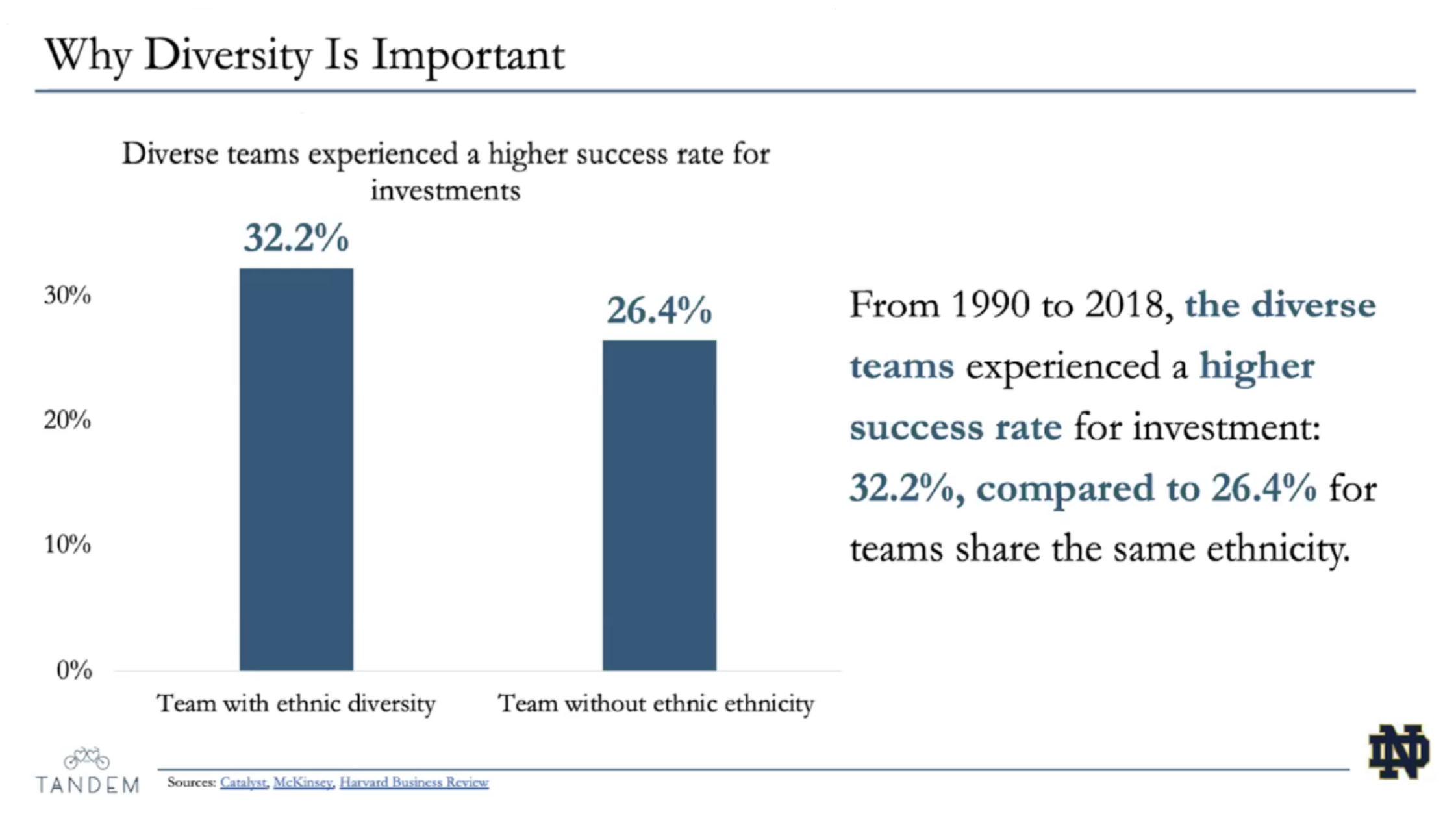
Vague Title
The title is far too vague. Why diversity is important...to whom? In what context? If many other slides from the same presentation would fit this title, your title may be too vague or too general.
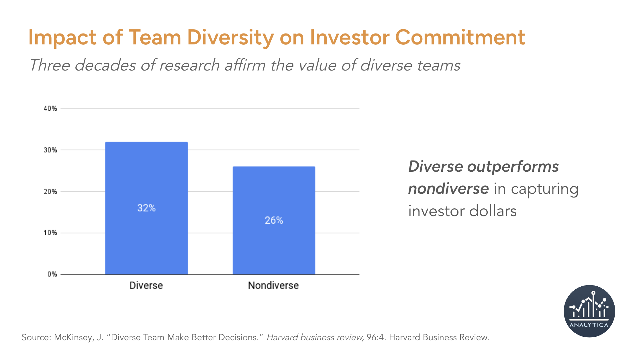
A more specific—but still value-neutral—title might be "Impact of Team Diversity on Investor Commitment."
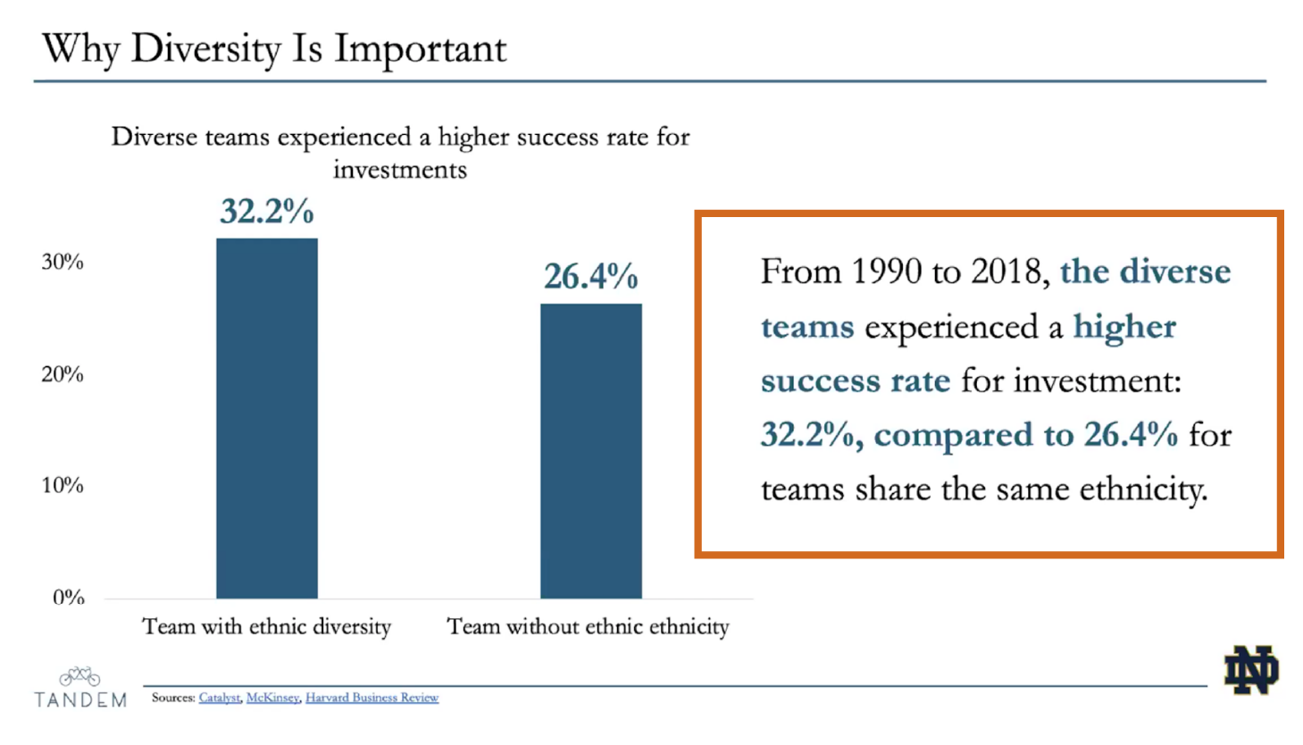
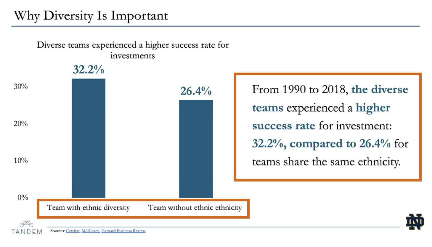
Explaining the Visual
Your chart or other visuals should speak for themselves. The highlighted text needlessly "explains" a visual chart in writing. This highlighted text is actually closer to what the presenter should say to the audience and so should be removed from the slide. By verbalizing this text, the author might use this space on the slide for the takeaway message, which could be shortened to something like "Ethnically diverse teams experienced a higher success rate for investments," or "Diverse outperforms nondiverse in capturing investor dollars."
Failing to Proofread
Failing to proofread your work damages your credibility with the audience. It suggests you are either unintelligent or, worse, lazy. Data-rich presentations require close attention to detail. Proofreading carefully will help people believe and trust your insights.
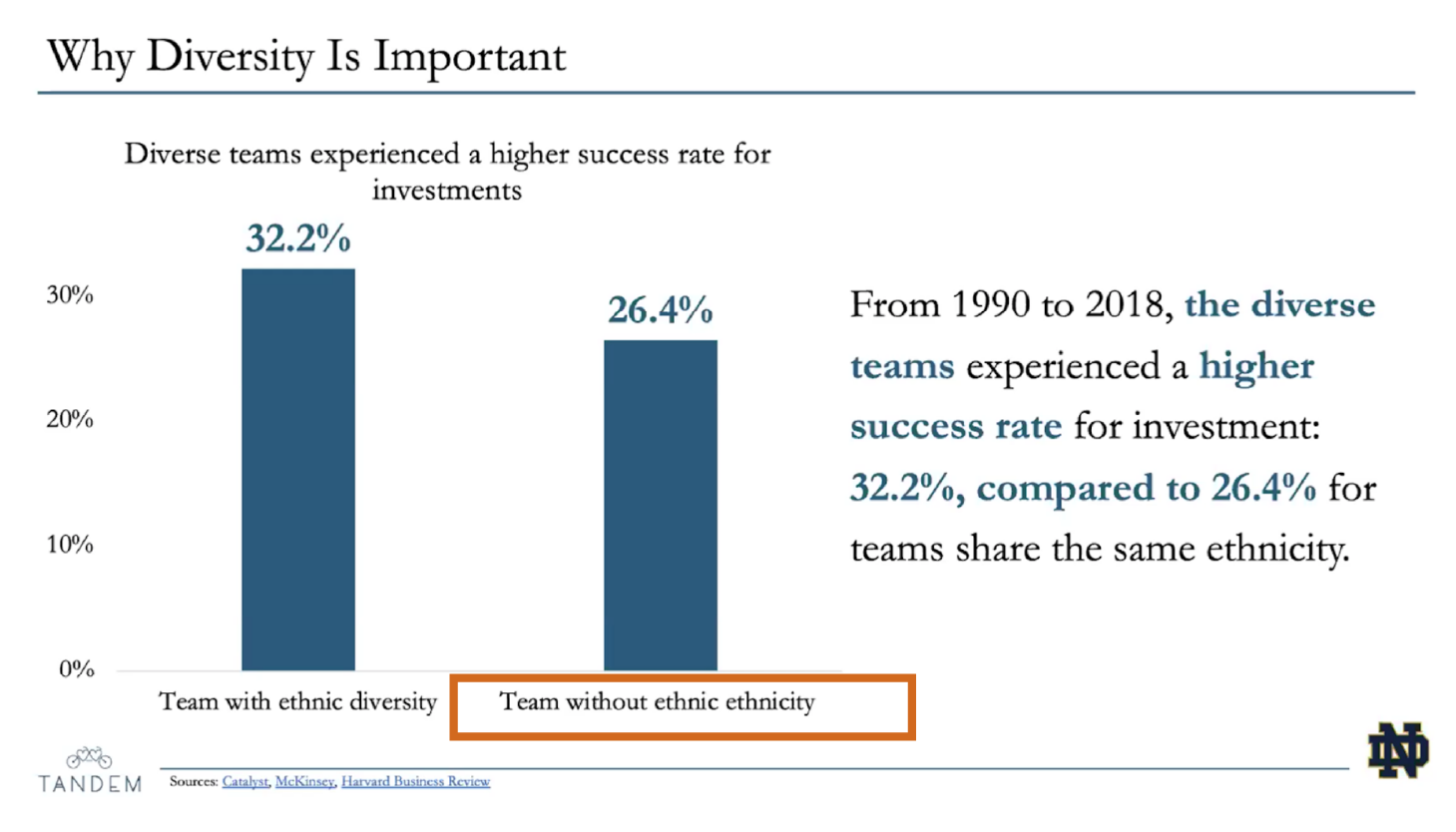
Overly wordy
The labels for both columns share essentially all the same words, leading to confusion and increasing the cognitive load on the viewer. Replace them with simple, clear alternatives: "Diverse" and "Nondiverse." As a rule of thumb, avoid verbosity. The more text you give the audience to read, the less time they have to listen to you.
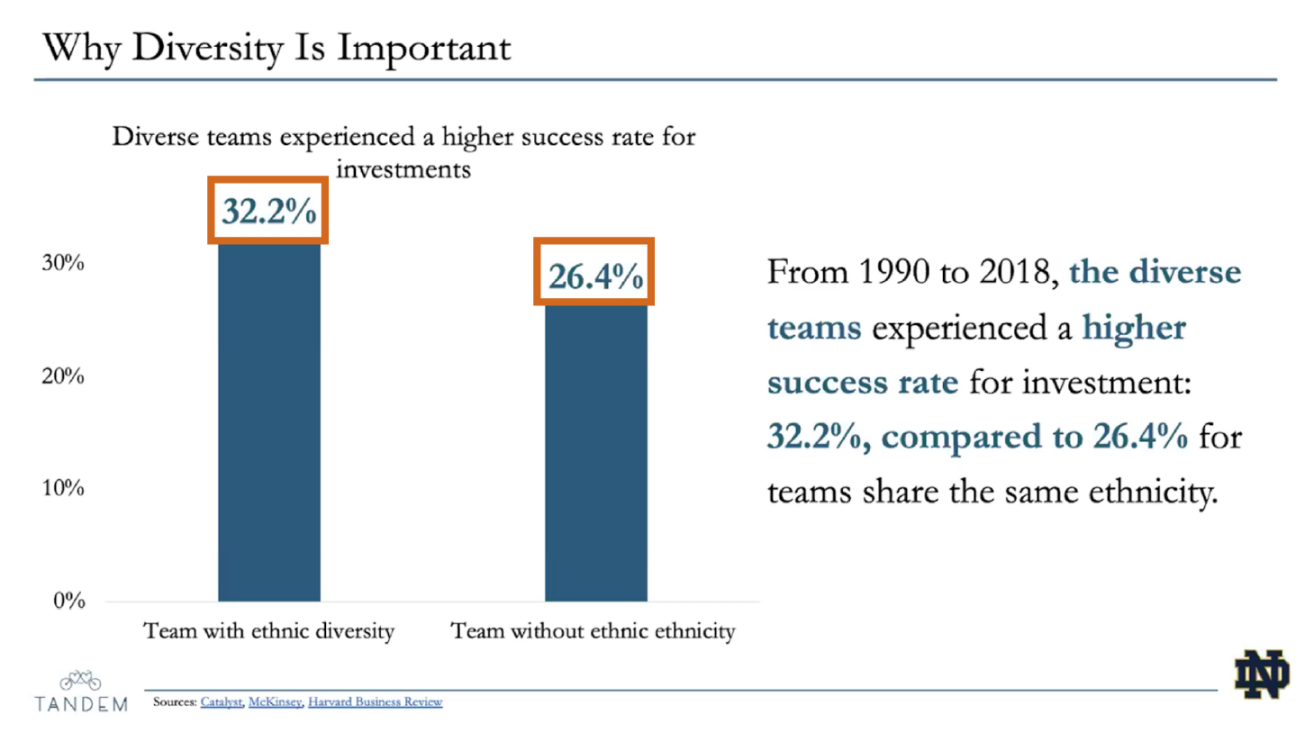
Simplify data labels
In this instance, because both floating-point integers are within two-tenths of a percentage point, we might consider rounding them down, especially since they're not measuring values like money, which at scale might prove significant. In this case, if we don't round down, the difference is 5.8. And if we do round down to 32% and 24%, the difference is 6. In this case, it's far easier to read the rounded values than their fractional counterparts.
The other thing we might investigate is embedding the values inside the columns, which would return more space to work with for our slide design.
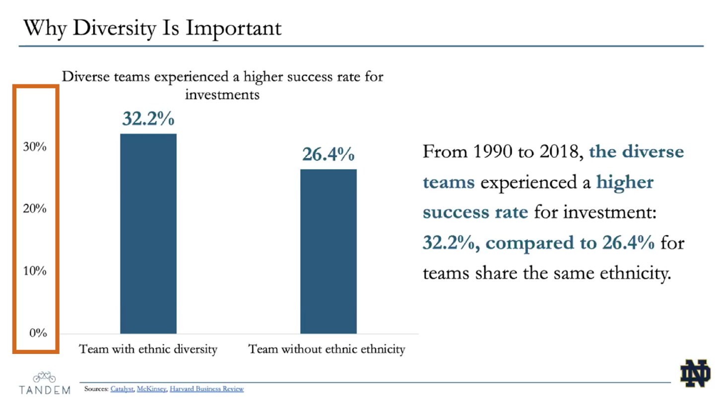
Incorrect y-axis
When structuring the y-axis of a column chart, the final value should be the next interval past the largest value plotted. In this case, since the largest value is 32%, and the intervals are 10 units, the last value on the y-axis should be 40%.
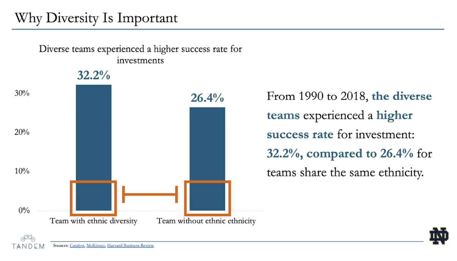
Incorrect column width
Humans have difficulty distinguishing the difference between the area of shapes. Moreso when thos shapes are farther apart. The columns here are too thin, as the space between columns should be half their width. Adjusting width will move them closer together, which will make comparison easier.
Let's Practice!
Use these questions to imagine how to redesign this chart ...
Let these questions guide you in imagining how to improve our example slide. Click each question to view a hint.
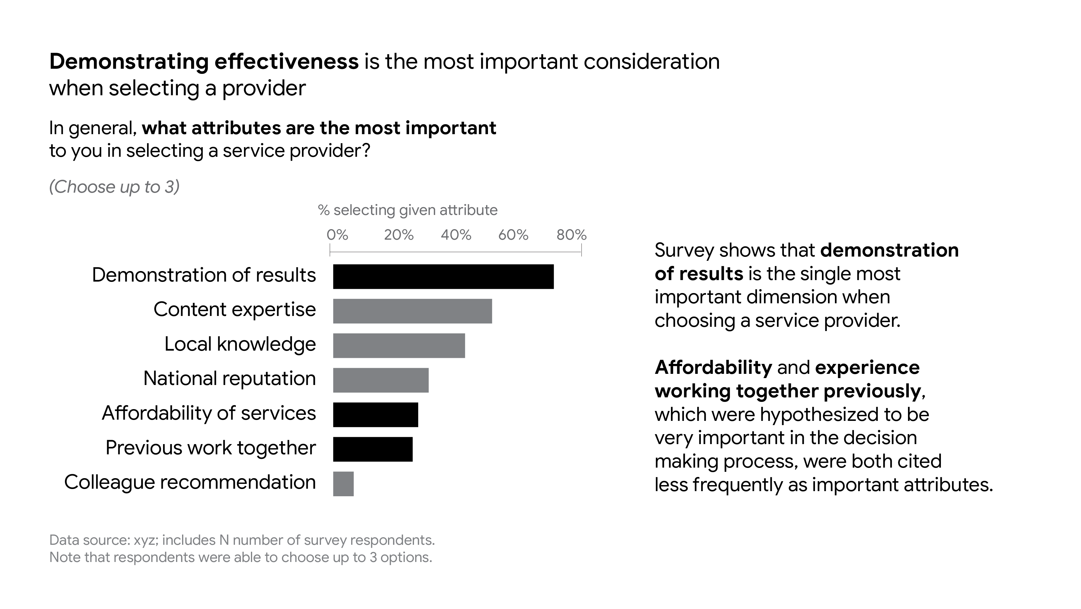
hint?
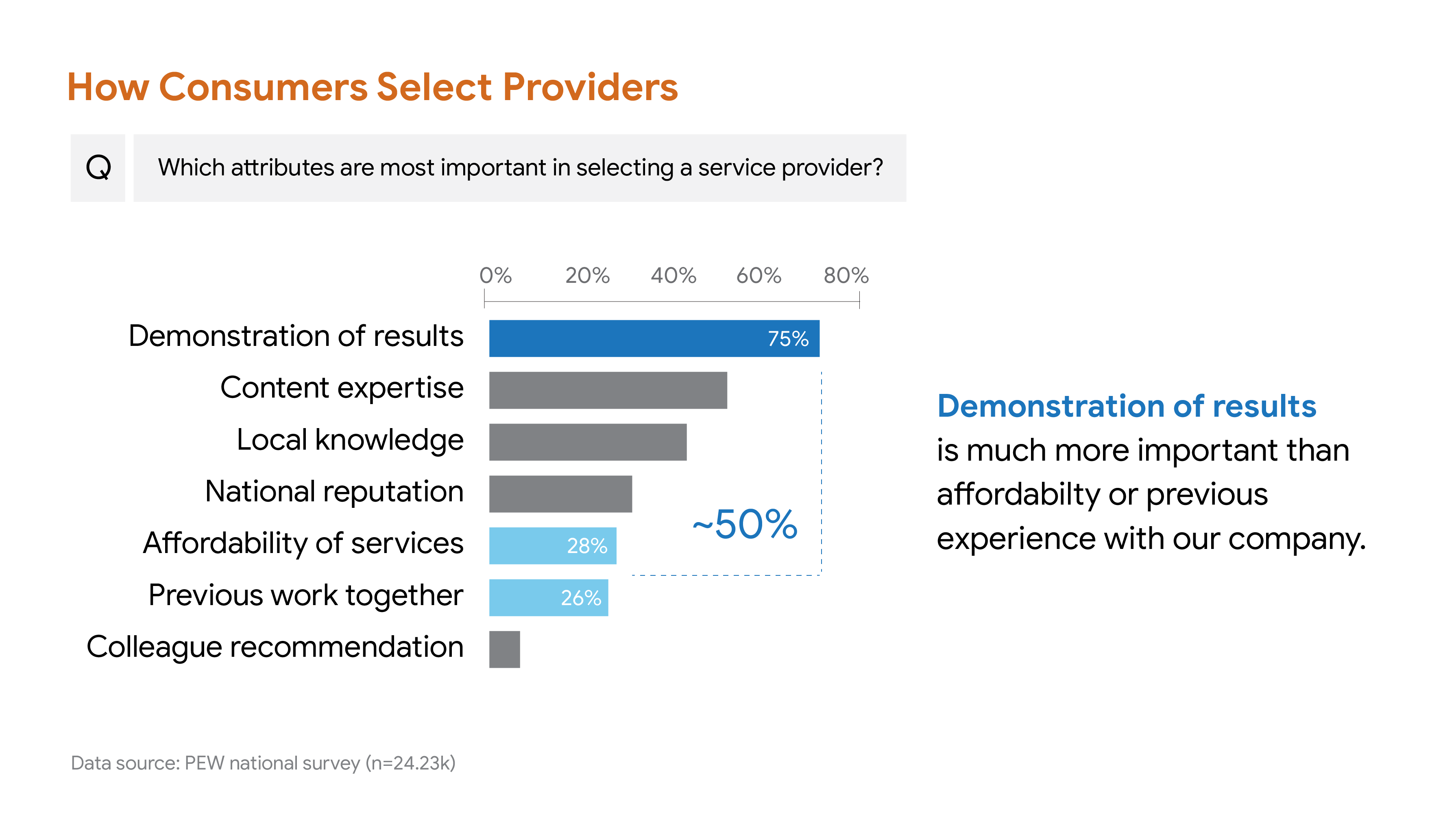
This title is quite long. And since it reflects the insight provided by the chart, we might do better to think of it as the takeaway. A good title will be value neutral with no fluff, according to Duarte, and describes what is being measured. It is more often a pithy phrase than a longer sentence. You could do worse than "How Our Customers Select Providers", which is succinct but descriptive.
hint?
This subtitle introduces the survey question, which is useful for providing context for the chart. However this subtitle is quite wordy. Consider tightening the text by removing the phrases "In general" and "to you": What attributes are most important in selecting a service provider?
hint?
Sources are ancillary (supplementary, supporting) information. It's important to source our data, but it's not there to help us drive home the central insight. For this reason, we make the font much smaller, lighter, and keep it out of the way, bottom left. In our example, above, we could also cut the entire second sentence, because it's not crucial to understanding the significance of the data that we know that respondents were allowed to select three options, only that 'Demonstration of Results" is so much more important than the authors had assumed.
hint?
The sentence in the space usually reserved for the title is a pretty great takeaway:
"Demonstrating effectiveness is the most important consideration when selecting a provider."
The use of bold as a preattentive attribute, emphasizing the attribute "Demonstrating Effectiveness," is a strong choice, although we might consider also using a color such as dark blue to match the bar color for that attribute on the chart. In that way we can use repetition of color to associate the chart and the takeaway more strongly.
hint?
Many words and phrases should be tightened and/or removed compltetely, in order to lower the cognitive load for your audience, including removing the following:
hint?
For each slide, I recommend you write a brief script. It's important to remember that you will not be reading that script verbatim during your presentation. The act of writing the script is simply to help you create unified content to include, and perhaps discover useful turns of phrase and transitions. However, you will not be reading the script verbatim to your audience. After you write your script, break that script into talking points. If your slides are kept simple and well designed to focus on a single insight, it should be easy to look at the slide and remember your talking points, and to deliver them in ways that help you connect with the audience
For the example slide, above, the text in the place usually reserved for the takeaway probably makes up the majority of the script. For example:
Sample Script
"We wanted to know how our customers chose us? And so we asked them ‘Which attributes are important when you select a service provider?’ We’d assumed it was Affordability, and Familiarity with us. It turns out, Demonstration of results is nearly 50% more important than prior experience with us, and even affordability. This is an indicator that we need to shift our focus somewhat and elevate Quality Assurance...
Additional Examples
The good, the bad and the misleading ...